What makes a good senior living community website?
Is it aesthetics?
That’s definitely part of it. But it’s too easy to get caught up in finding the perfect shade of green or the ultimate font combination.
Seniors and their adult children aren’t visiting your website to gauge your knowledge of HTML and CSS. They’re looking for a comfortable, safe place to live with lots of things to do run by people who are caring, knowledgeable, and trustworthy.
Does your website convey that? Or is the best thing you can say about your site is that the blue really pops?
If you want your website to do more than look slick, like build brand awareness, resonate with your ideal resident, or generate leads, there has to be more to it than how it looks.
So is it usability that makes a website exceptional?
We all know someone who found a job, found a new apartment, or sold something on Cragislist. The site is wildly successful, mostly intuitive, and highly usable. But it’s not 1995 any more. No senior living community or web designer is going to go with the Craigslist look.
What Really Makes a Good Senior Living Website
Web design is a topic that invites debate. Some believe your site needs a cutting edge design. Others think that web design doesn’t matter much as long as the website loads and visitors can find the information they want.
Both answers are right, but not all the time. It depends on the business you’re in and the functionality your website provides.
For senior living communities, there are several simple design best practices every website should follow. And there are certain features and approaches that set good senior living websites apart from the merely adequate or poorly designed sites.
Good senior living websites strike a balance between visual design and function. They are uncluttered and easy to navigate without sacrificing aesthetic appeal. They use fonts that are easy to read and there’s a clear visual hierarchy that directs visitors to where they want to go.
Well designed senior living websites speak to their target audience. They understand why visitors come to their website. The design helps site users do what they want to do whether it’s find out more about the community, see photos and floor plans, or schedule an onsite visit.
From a marketing perspective, good senior living web design highlights a community’s unique value proposition. It’s obvious what you want site visitors to do and it’s easy to do it with impossible to miss buttons, clear calls to action, and shorter forms to fill out. Testimonials are visible for credibility and photos of actual residents are used for authenticity instead of cheesy stock photos.
Here are 7 senior living communities that get it right:
Robson Resort Communities
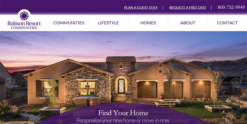
Robson Resort Communities offers luxury retirement communities in Arizona and Texas for active seniors.
What I like about the Robson Resort Communities website:
- Slick, modern design.
- Stunning photos of their properties.
- Simple and clear navigation.
- Easy to use home finder tool on the front page.
- Responsive. Looks good on tablets and smartphones.
What I would consider changing:
- The auto scrolling slider on the home page. They’re distracting and they’ve been proven to kill conversion rates. A really nice overview video makes up one of the slides, but a lot of people might not know it’s there. I’d remove the slider and make the video more prominent.
- Add a testimonial to the home page. If you visit the dedicated page for each community, you’ll see some genuine video testimonials from happy residents. I’d feature one or more on the home page.
GenCare Lifestyle
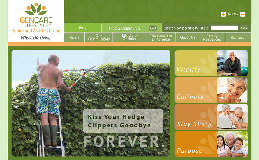
GenCare Lifestyle operates a number of independent and assisted living communities in Washington state.
What I like about the GenCare Lifestyle website:
- Uses humor on their home page to grab attention. Not an approach you see very often in the senior living space.
- Good accessibility features with a text size widget and a mobile version of the site with an option to view the full site.
- Very polished overview video on the home page.
- Benefits driven copy.
What I would consider changing:
- Make it easier for future residents and their adult children to get in touch. The Contact page instructs prospects to call, but I’d add a short form and have the phone number featured prominently in the header on every page.
- Obvious stock photos on the site including the infamous stock photo cliche Women Laughing Alone With Salad. More photos of residents and amenities please.
- There’s a link in the main navigation to a blog hosted offsite that seems abandoned. Blogging is a great way to connect with prospects and demonstrate expertise. I would commit to it and host it on the company domain if possible or take the link out of the nav.
Leisure Care
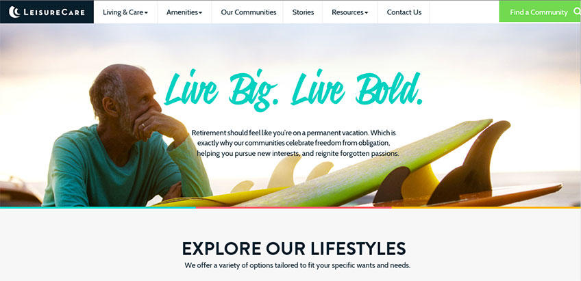
Leisure Care is one of the largest privately held retirement community companies in the U.S. operating communities in several states.
What I like about the Leisure Care website:
- Clean design with lots of whitespace which makes the copy very easy to read.
- Resident profiles right on the home page in a section titled “Meet Fun People. Do Fun Things.”
- The individual community pages are packed with helpful information and contain clear calls to action.
What I would consider changing:
- Experiment with video. The static photos and slideshows on the community pages are well done, but I’d test to see if 2-3 minute videos improve inquiry rates.
Brookdale
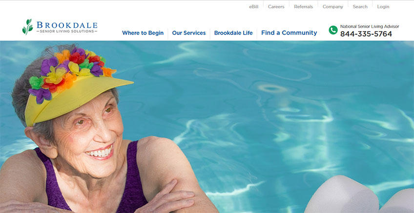
Brookdale Senior Living is the largest owner and operator of senior living communities in the country, operating over 1,100 senior living and retirement communities in 47 states.
What I like about the Brookdale website:
- Great navigation. The sticky menu at the top makes it easy to get where you want to go from any page on the site.
- Big call to action buttons that can’t be missed.
- Phone number in big, bold text part of the sticky menu.
- Excellent use of videos on the home page.
What I would consider changing:
- Again, obvious stock photos. With so many communities, there has to be a way to get some shots of real residents on the home page.
- For those that don’t want to call, the Contact Us link is in the footer. I’d move that to the nav menu.
- The hero image at the top of the home page has no messaging or call to action. I’d test a value proposition and a CTA button there. Don’t want to subtract from the impact of the picture, but don’t want people who land there having to think about what to do.
Atria Senior Living
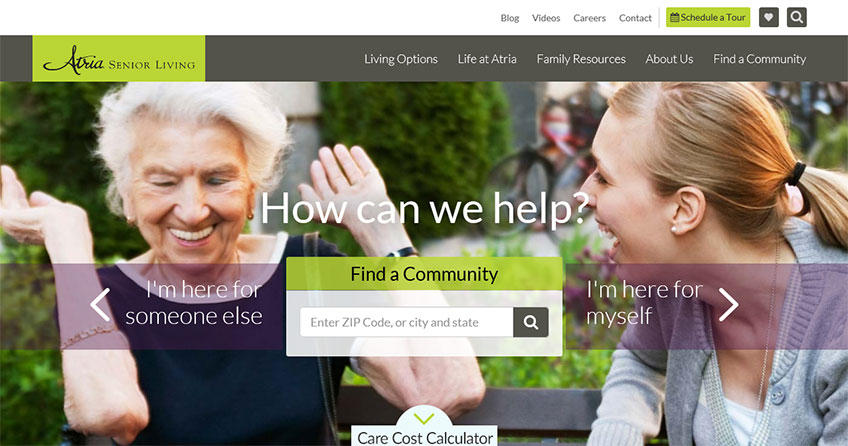
Atria Senior Living operates 190 communities for seniors throughout the U.S. and Canada housing over 21,000 residents.
What I like about the Atria Senior Living website:
- Very easy for seniors or adult children to navigate and find information.
- Use of videos on the home page including testimonials as well as overviews of the lifestyle and programs they offer.
- Active on social media and their blog. Both are well integrated into their site.
What I would consider changing:
- Reorder the content on the home page. The video library contains some great content that I’m sure drives inquiries, but you have to scroll past the blog post previews and the Careers section to get to it.
Bella Vista Senior Living
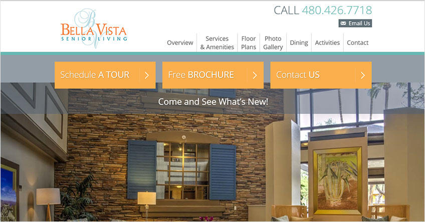
Bella Vista Senior Living is a high-end independent and assisted senior living community located in Mesa, Arizona.
What I like about the Bella Vista Senior Living website:
- Very apparent where to click for the information you want.
- Their contact info is prominent throughout the site so there should be no question about how to get in touch with them.
- Beautiful photos of the property.
What I would consider changing:
- There’s a wall of text on the home page. I’d break it up to make it easier to read.
- They have a testimonials page where they pull in reviews from Yelp and SeniorAdvisor. They have some very happy residents and family members. I’d like to see that on the front page.
Panorama
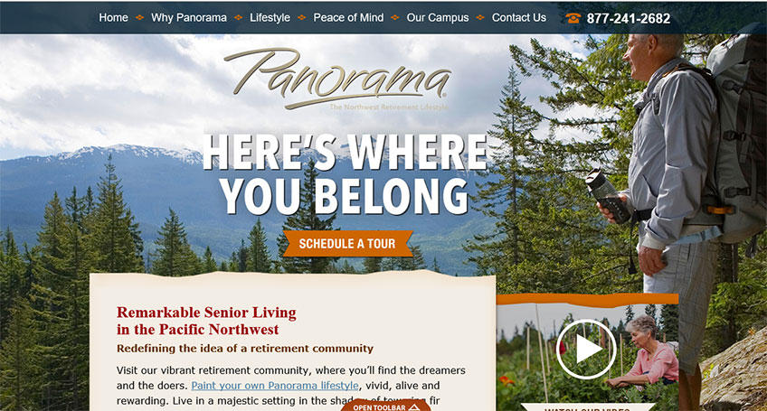
Panorama is a non-profit continuing care retirement community (CCRC) near Olympia, Washington with a 140 acre campus.
What I like about the Panorama retirement community website:
- Aesthetically pleasing on desktops and mobile devices.
- Clear calls to action above the fold and a phone number in the nav menu.
- Site has very cohesive messaging. They’re promoting a specific retirement lifestyle that shines through on all their pages.
- Excellent blog content. Senior living community blogs are sometimes an odd mix of recipes and self promotional material, but the Panorama blog features contributions from residents. What better way to speak your target audience’s language?
What I would consider changing:
- The sticky toolbar at the bottom is a bit busy. It contains a text size widget, a drop down menu, and a back to top link. There’s also an option to hide it which suggests maybe it shouldn’t be there since there’s already a sticky menu on top.
What We Can Learn from the Best Senior Living Community Websites
As you can see from the many different styles and design approaches of the sites on this list, there is no playbook or checklist you can use to create the perfect senior living website. You can also see that standout senior living websites share several common elements.
Simplicity, good navigation, strong visuals, ease of use, accessibility, credibility, and authenticity contribute to making these websites outstanding. Keep these principles in mind when you’re designing or redesigning your senior living community’s website.